

Honda
While a good portion of this project isn’t available to show due to an NDA, below you’ll find a brief, yet thorough, exploration into Honda’s third party checkout process for their electric vehicles.
Team Members
The Client
UX Designer: Cayce Cooter
Art Directors: Linda Saita, Juniper Bower
Creative Director: Liz Cordingley
Honda Automotives
My Role
UX Design
UI Design
Product Design
Tools
Figma
Notion
Sketch

Overview
Challenge
Our focus was on the redesign of Honda's third-party checkout process to enhance the user experience and streamline the online purchasing journey for potential car buyers. The goal is to identify pain points, improve usability, and optimize the checkout process to increase conversions and customer satisfaction.
Solution
Implement visual guides to aid users in estimating remaining tasks and for quick navigation.
Clean up the hierarchy to reflect the value of the vehicles and make it as clear as possible for the user.
Project goals
Identify existing pain points and usability issues in Honda's third-party checkout process.
Increase conversion rates by optimizing the checkout process and minimizing cart abandonment by adding visual breadcrumb navigation.
Redesign the checkout flow to improve usability, reduce friction, and enhance the overall user experience.
Research Strategy
The team analyzed the check-out process of other automative websites, studying best practices and identifying opportunities for improvement.
competitive Audit
We studied competitors both in the auto industry as well as out and constructed a thorough visual analysis.

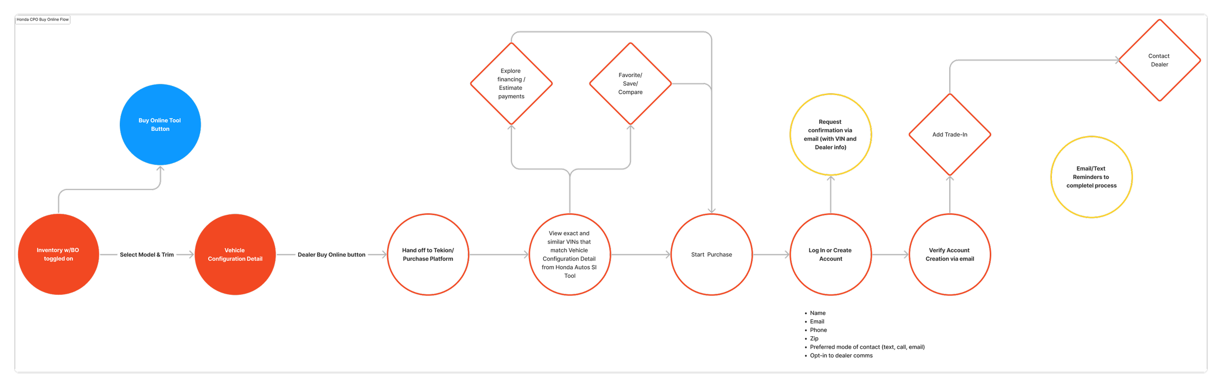
User Flow
We dissected the competitive audits, created user flows for both Honda’s auto buy online process and for their CPO buy online process.
Iterations & Development
The feedback obtained from our user strategists was analyzed, we reviewed internally several times, and necessary refinements were made to the check-out process design. Because of an NDA, I am only allowed to share select screens from this project, but the ones below show the focus on responsiveness and show how we tackled Honda and Acura’s branding in this layout.


Conclusion
Client feedback was positive and this project is currently in development. If I were to have more time with this project I would most like to suggest more out-of-the-box functionality features that I came across in our discovery phase and lean further into expanding the users ease of navigation by adding bolder breadcrumbs with visual aids.